Introduction to Gnuplot.
"Gnuplot is a portable command-line driven graphing utility for Linux, OS/2, MS Windows, OSX, VMS, and many other platforms. The source code is copyrighted but freely distributed. It was originally created to allow scientists and students to visualize mathematical functions and data interactively, but has grown to support many non-interactive uses such as web scripting. It is also used as a plotting engine by third-party applications like Octave. Gnuplot has been supported and under active development since 1986."
The paragraph above is how Gnuplot is described on the Gnuplot website. Here are some of the features of this amazing piece of software:
- Gnuplot is freeware and available for all major platforms.
- Gnuplot supports many different types of 2D and 3D plots: lines, boxes, error bars, histograms, ...
- Gnuplot supports many different types of output: interactive screen display, direct output to file (pdf, png, gif, jpeg, and lots others), mouseable web display formats (HTML5, svg).
- Gnuplot allows to easily draw mathematical and other function, draw graphs and histograms based on data input files, determine the fitting graph to a set of experimental or statistical data points, ...
- Gnuplot commands are easy to understand and easy to remember.
- Gnuplot is a command line program, so can be launched from any application, written in any programming language. Creating an image file of the graph to plot, this file can then be displayed or otherwise used in the calling application.
This tutorial is about the usage of Gnuplot 6.01, 64-bit (mingw) on Windows 10. I suppose that most of what is said here also applies to other versions of Gnuplot and other operating systems. You can download the Gnuplot for Windows installer from Sourceforge. During installation, you can set the Gnuplot default terminal (it's where the Gnuplot output should go to by default). I changed the original setting, selecting the windows terminal (that worked well with all that I tried out).
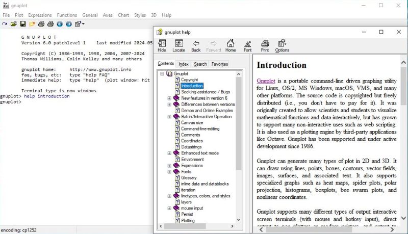
The setup program creates two launchers in Windows Start menu, one for an interactive graphical shell, the other for an interactive command line shell; it's the first one of these that will be used throughout this tutorial. The screenshot below shows this shell at startup, together with the help documentation, opened from the application menu bar (where most entries actually correspond to given Gnuplot command).
|
This tutorial is intended for beginners, and only covers the basics of the application usage. For further details, you can have a look at the Gnuplot User Manual. There are also several books in PDF format available on the Internet; e.g. Gnuplot in Action.
2D graphs plotting.
2D plots are created using the plot command. In its simplest form, it's followed by a single parameter, that is the definition of the function to plot. In this case, all display parameters (range of the x and y values, graph labels, colors, etc) will use default values (that you can change by specifying new values as options of the plot command, or by using the set command).
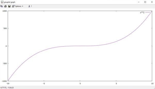
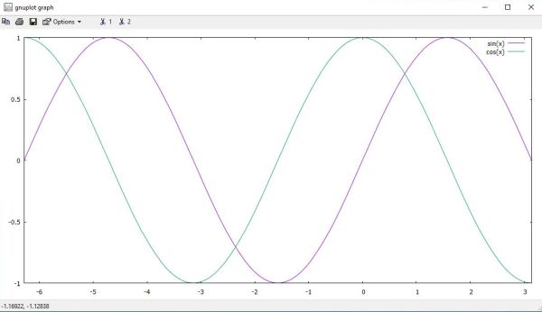
The following two commands display the functions f(x) = x3 (screenshot on the left), resp. the two functions f1(x) = sin(x) and f2(x) = cos(x) (screenshot on the
right).
plot x**3
plot sin(x), cos(x)
|
|
Note that if there is no range specified for the x-values, Gnuplot takes the default interval [-10; 10]. The interval taken for the y-values depends on the function minimum and maximum for the x-values considered.
To set a custom range of the x-values, you can specify the first and last values (separated by a colon, not a comma!) between square brackets
immediately after the plot command. To set a function label, you can specify it using the title (t) option. Note,
that the label has to be put between quotes. Both single and double quotes may be used. These are however not always used in a same way; in fact, in a string between
double quotes (as is also the case in Perl, for example) backslashes are interpreted as introducing an escape character (e.g. "\n" corresponding to an end-of-line character).
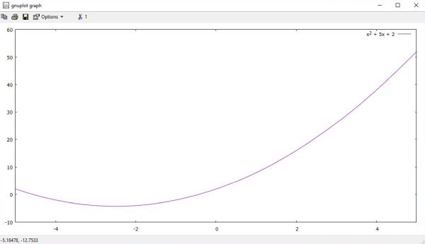
The following command displays the function f(x) = x2 + 5x + 2 for x included in the interval [-5; 5]. Note that in the function label string Gnuplot
automatically converts "^2" to an superscript 2.
plot [-5:5] x**2 + 5 * x + 2 title "x^2 + 5x + 2"
|
Function definitions (as well as the values of other plot settings) may include variables. We can for example consider the function
a * x**2 + b * x + c, setting the variables to given values and plot the function. A quick way to plot similar functions is to change the value of one or several of the
variables and use the replot (rep) command to plot the function as defined in the preceding plot command. The
following commands first plot the function x2 + 5x + 2, then the function x2 - 5x.
a = 1
b = 5
c = 2
plot a * x**2 + b * x + c
b = -5
replot
Whereas we will usually set a custom x-values range (depending on the function and the part of it that we are interested in), we will normally not set a y-values range,
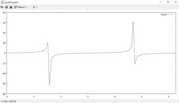
thus using the default interval, determined by the minimum and maximum function values for the x-values considered. However, this will not always work! Consider, for
example, f(x) = tan(x). If we display it for x-values between 0 and 2π using the command
plot [0:2*pi] tan(x)
we will get the graph shown on the screenshot below. Definitively nothing to do with a tangent graph!
|
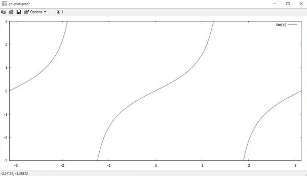
To get a correct display of this graph, we'll have to use a custom, small y-values range, as for example -4 to 4, or -3 to 3. To set a custom range of
the y-values, we use the command set yrange, followed by the interval between square brackets. Note that instead of defining the
x-values range as option of the plot command, we can also use the command set xrange. Here is the code to correctly
display a tangent graph:
set xrange [0:2*pi]
set yrange [-3:3]
plot tan(x)
|
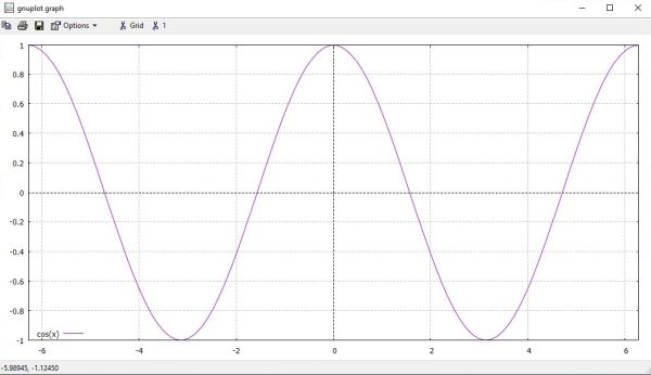
We can display the coordinate system zero-axes using the commands set xzeroaxis and set
yzeroaxis. Sometimes, it's interesting to display a grid, what can be done using the command set grid. Another
thing that we sometimes might want to do in order to get a "prettier" display, is to change the position of the legend; this is done using the
command set key. The following code displays a cosine graph for an x-value interval of [-2π;2π]. The two axes and the grid are also
displayed, and the legend is positioned at the bottom left corner of the drawing.
set grid
set xzeroaxis
set yzeroaxis
set key bottom left
plot [-2*pi:2*pi] cos(x)
|
The color of a graph can be changed using the linecolor (lc) option of the plot command. There are lots of possibilities to specify the color to be used. The probably easiest for most of us is to specify it as rgb "color-name", or rgb "#RRGGBB", where "color-name" is one of the built in color names (use the command show colornames to display them), and "#RRGGBB" is the hexadecimal RGB color value.
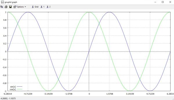
The following graph is an extension of the previous one. This time, we display 2 graphs (the sine and the cosine), using custom colors. But, we make another change to
the graph. If you look at the screenshot above, you probably say to yourself that the tics on the x-axis are not really useful, and that it would make more sense to use
tics for values that are, for example, multiples of π/2. We can modify the x-axis tics using the command set xtics.
There are lots of possibilities that all in all allow you to get the tics values just as you want; this rather advanced topics is outside the scope of this tutorial.
Here is just a simple example of what you can do: Setting tics starting from a beginning value (here: -2π) and specifying an increment (here: π/2) to get the next ones.
If you want, you can also specify an ending value (not done here). Here is the code that creates the plot shown on the screenshot.
set grid
set xzeroaxis
set yzeroaxis
set key bottom left
set xrange [-2*pi:2*pi]
set xtics -2*pi, pi/2
plot sin(x) lc rgb "blue", cos(x) lc rgb "green"
|
Note that the width of a graph can be changed using the linewidth (lw) option of the plot command.
Gnuplot allows to insert text into graphs (ex: Gnuplot can calculate the maximum of a function and write the string "max" with an arrow pointing to the corresponding point on the graph). This topic is not covered in this tutorial; just mentioning textcolor (tc), that is for text, what linecolor (lc) is for lines.
We can give a title to the plot using the command set title. To set labels for the x- and
y-axis, we use the commands and set xlabel and set ylabel. The code below displays two radioactive decay
graphs. The two axes are labeled, and the two function labels are changed. Also, there are custom ranges for the x- and y-values (the custom range for the y-values is
just a choice, not something required).
set title "Radioactive decay"
set xlabel "Time (s)"
set ylabel "Disintegrations"
set xrange [0:600]
set yrange [0:60]
plot 50 * exp(-x/150) t "Decay 1", 50 * exp(-x/250) t "Decay 2"
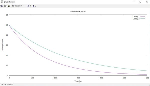
|
Gnuplot offers a very easy way to reverse a setting to its original state: the command unset. Thus, for example, unset title removes the drawing's title; unset xrange resets the x-values interval to the default [-10:10].
3D graphs plotting.
3D plots are more complex than graphs in two dimensions and will not be detailed in this tutorial. Just some very basics... To create a 3D drawing, we have to use the
splot command. Here is the command to plot the function f(x) = sin(x) * cos(x), with both the x- and y-values interval set to [-3;3]:
splot [x=-3:3] [y=-3:3] sin(x) * cos(x)
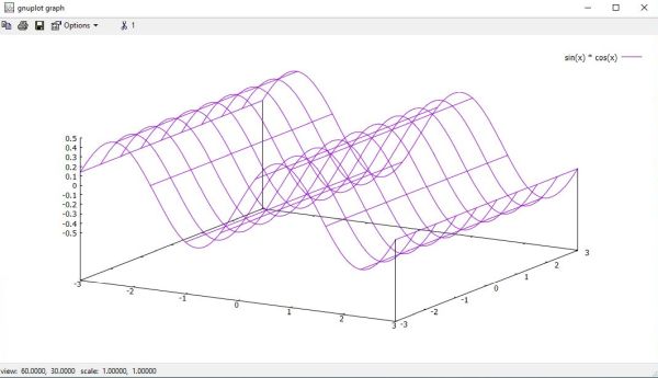
|
A more accurate display of the graph is obtained by setting a custom z-values range, what can be done using the command set
zrange. Here are the commands that create the graph shown on the screenshot below:
set zrange [-1.0:1.0]
splot [x=-3:3] [y=-3:3] sin(x) * cos(x)
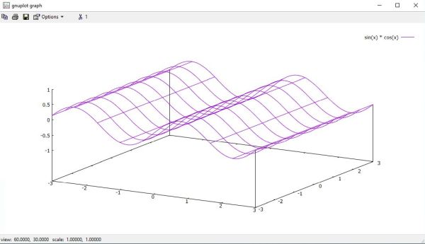
|
In fact, the command splot plots a function as a surface. A simple means of plotting a surface is using
isolines. For a surface s(u, v), by fixing the u parameter, the iso-u lines of the form c(v) = s(u0,v) are produced, and by fixing the v
parameter, the iso-v lines of the form c(u) = s(u,v0) are produced. The isoline density (grid) for plotting functions as surfaces may be changed by the
set isosamples command. By default, sampling is set to 10 isolines per u or v axis. A higher sampling rate will produce more accurate plots.
The following commands will create first the graph shown on the left screenshot, then the one on the right screenshot. Note, that if only one isosamples value is specified,
the second is assumed to be the same.
set zrange [-1.0:1.0]
set isosample 50
splot [x=-3:3] [y=-3:3] sin(x) * cos(x)
set isosample 25, 50
replot
![Gnuplot on Windows 10: 3D plot with custom sampling rate [1] Gnuplot on Windows 10: 3D plot with custom sampling rate [1]](../screenshots/gnuplot11a.jpg)
|
![Gnuplot on Windows 10: 3D plot with custom sampling rate [2] Gnuplot on Windows 10: 3D plot with custom sampling rate [2]](../screenshots/gnuplot11b.jpg)
|
The command set hidden3d enables hidden line removal for surface plotting. Without further explanations given here,
just watch how the display changes when the simplest form of this command is used, as in the following code:
set zrange [-1.0:1.0]
set isosample 40
set hidden3d
splot [x=-3:3] [y=-3:3] sin(x) * cos(x)
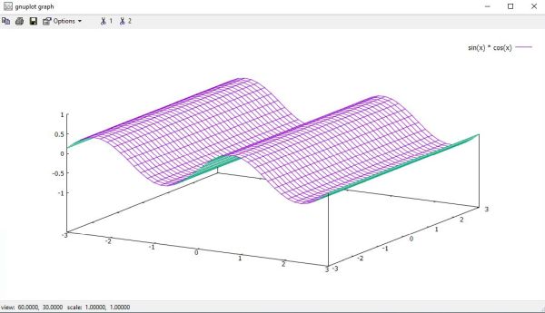
|
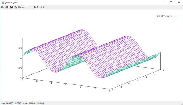
Normally, the zero-point of the z-axis is placed above the xy-plane. To move this origin onto the xy-plane, you can use the
set xyplane command, as shown in the example below.
set zrange [-1.0:1.0]
set isosample 40
set hidden3d
set xyplane relative 0
splot [x=-3:3] [y=-3:3] sin(x) * cos(x)
|
Note: The command set xyplane relative 0 replaces the depreciated command set ticslevel 0, that you find in older Gnuplot code examples.
The view point in the 3-dimensional plot is controlled by the set view command. Again without further explanations
given here, just watch how the display changes when we change the view point (the default view point values are 60, 30), as in the following code:
set zrange [-1.0:1.0]
set isosample 40
set hidden3d
set xyplane relative 0
set view 60, 15
splot [x=-3:3] [y=-3:3] sin(x) * cos(x)
set view 60, 75
replot
![Gnuplot on Windows 10: 3D plot view points [1] Gnuplot on Windows 10: 3D plot view points [1]](../screenshots/gnuplot14a.jpg)
|
![Gnuplot on Windows 10: 3D plot view points [2] Gnuplot on Windows 10: 3D plot view points [2]](../screenshots/gnuplot14b.jpg)
|
Note: If you are interested in some nice 3D graphs created by Gnuplot, these surface demos at the Gnuplot website might be what you are searching for...
Data files plotting.
Gnuplot makes it easy to create a graph of experimental or statistical data contained in a file. Such files are simple text files, where the x, y, and other data is organized in columns. These columns are not positional within the text lines, but are defined by data (mostly numbers) separated by a separator string. By default, the separator string consists of one or more spaces. This is a good thing, because it allows us to line up the numbers in a column just as we want.
In the following example, we'll plot a graph of the population of Luxembourg versus time, based on the file luxpop.txt with the following content:
# Population Luxembourg
1955 305514
1960 314168
1965 329794
1970 339342
1975 353666
1980 363741
1985 366466
1990 381267
1995 407635
2000 435628
2005 464860
2010 507070
2015 569408
2020 630399
# Forecast...
2025 668100
2030 697086
2035 722516
2040 744884
2045 764687
2050 781910
As you probably imagined, lines starting with a number sign (#) are comments and will be ignored; so are empty lines.
To use the data file without indicating a path, we have to set the Gnuplot working directory to the directory that contains the file. As in Windows Command Prompt, this
can be done using the cd command (you can also use the File > Change directory command of the shell menu bar.
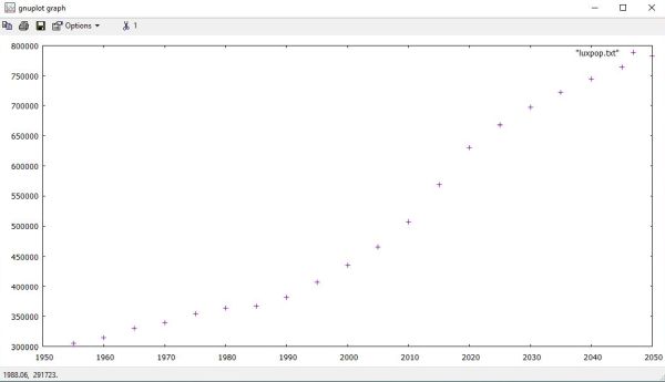
The simplest command to create a graph from our file is as follows:
plot "luxpop.txt"
This creates a graph with all default values, using the style points. With this style, the graph is a sequence of symbols (by default a "+")
representing the y-values for all x-values in the data file.
|
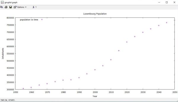
As a little review of what we learned before, lets create a graph with title and axes labels. Also replace the "luxpop.txt" function label and re-position the legend.
Here is the code that creates the plot shown on the screenshot below.
set title "Luxembourg Population"
set key top left
set xlabel "Year"
set ylabel "Inhabitants"
plot "luxpop.txt" title "population vs time"
|
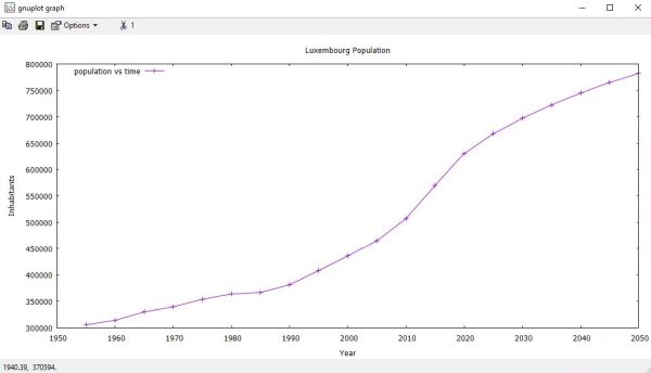
In most cases, we would prefer a "complete graph" and not only individual points. This is done by using one of the line styles
lines, or linespoints (linesp); the difference is that with the latter style, the individual points corresponding
to the file data values are also printed (as "+"). To set a style for a given graph, we use the option with (w) of the
plot command. The following commands plot our graph as a line, resp. a line plus the data points:
plot "luxpop.txt" with lines
plot "luxpop.txt" with linesp
The screenshot below shows a "linespoints" graph of the Luxembourg population vs time. The code used to create it, is the same as in the example before, except that with linesp has been added at the end of the plot command.
|
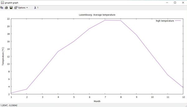
Consider a file called luxclim.txt, that contains the following statistical data about the climate in Luxembourg.
# Climate Luxembourg: Monthly Averages
# Col 1: Month
# Col 2: Average low temperature (°C)
# Col 3: Average high temperature (°C)
# Col 4: Average precipitation (mm)
# Col 5: Mean monthly sunshine (h)
1 -1.83 2.28 126.48 4.97
2 -1.81 3.30 104.24 6.40
3 0.81 8.16 85.39 8.89
4 3.71 13.29 73.05 11.62
5 6.16 15.94 131.64 12.88
6 9.91 19.34 136.79 13.17
7 11.63 21.57 118.61 13.44
8 11.70 21.52 115.55 12.82
9 8.65 17.74 89.01 10.60
10 5.66 12.41 93.15 7.27
11 2.09 7.10 97.57 5.65
12 -0.38 3.71 150.21 4.54
This file contains 4 different datasets (sets of y-values), and we can use Gnuplot to draw a graph for either of them. Concerning the graph of the average low temperature, no problem: we can do it just the same way as we did for the population in the examples before. But how to proceed in order to create, for example, a graph of the average high temperature? The columns of a file to be considered when creating a graph from a data file can be indicated using the using (u) option of the plot command. This parameter is normally followed by two numbers, separated by a colon. The first number indicates the column with the x-values, the second the column with the y-values; example, for the average high temperature: using 1:3.
Here are the Gnuplot commands that create the graph shown on the screenshot below.
set title "Luxembourg: Average temperature"
set xlabel "Month"
set ylabel "Temperature (°C)"
set xtics 1,1
plot [1:] "luxclim.txt" using 1:3 title "high temperature" with lines
|
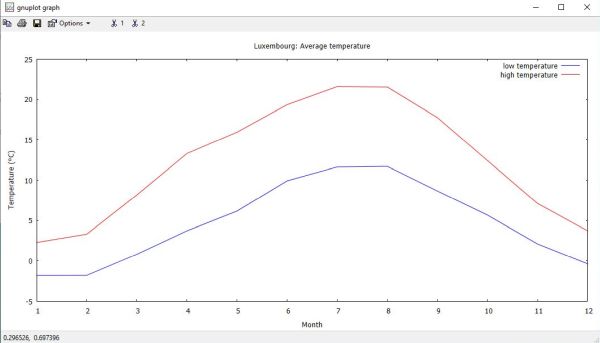
And finally, lets create a drawing that shows both the low and high average temperatures. Code:
set title "Luxembourg: Average temperature"
set xlabel "Month"
set ylabel "Temperature (°C)"
set xtics 1,1
plot [1:] "luxclim.txt" using 1:2 title "low temperature" lc rgb "blue" with lines, [1:] "" using 1:3 title "high temperature" lc rgb "red" with lines
|
Boxes and histograms.
In 2D plots the boxes style draws a rectangle centered about the given x coordinate that extends from the x axis, i.e. from y=0 not from the graph border, to the given y coordinate. The width of the box can be provided in an additional input column or controlled by the command set boxwidth. Otherwise each box extends to touch the adjacent boxes. The boxes style may be used to draw bar charts.
Consider a file called gdp.txt, that contains the following statistical data about the world GDP per capita.
# GDP per capita
# Col 3: Purchasing Power Parity (PPP)
# Col 4: Nominal GDP
0 Luxembourg 142214 127046
1 Singapore 127565 78115
2 Ireland 126905 105362
3 Norway 114899 106594
4 Qatar 114648 88046
5 U.A.Emirates 87729 53758
6 Switzerland 83598 92410
7 U.S.A. 76399 75269
8 Denmark 74005 67220
9 Netherlands 69577 56429
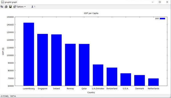
What we want to do in the following example is to draw a bar chart showing the PPP for the 10 countries mentioned in the file. This implies two new features to introduce: the boxes style, of course, but also the way to proceed to use string data (here: the country name) as x-values.
To draw boxes, we use the with boxes option of the plot command. If we don't want the boxes to touch each other, we can set the width of the box relative to 1 as the full width. For example, to use a boxes width of 75% of the default size, we can use the command set boxwidth 0.75. We can also set a box style, such for example filling the box with a color. This is done using the command set style fill solid; the color used is the one set by the linecolor option of the plot command.
The x and y values specified in the data file must be numeric; that's why the file contains a number sequence in column 1 (that will be used as x-values). As we want to draw the graph of the PPP, the y-values will be taken from column 3 (using 1:3 as option of the plot command). Gnuplot allows to generate axis tic labels via a string function, usually taking a data column as an argument. The simplest form uses the data column itself as a string. The function for the x-axis is called xticlabels (xtic); there are similar functions for the other axes. In our case, we want the x-axis tic labels being the country names, i.e. the data of column 3 in the file. This is done by adding xtic(2) as a third value to the using option: using 1:3:xtic(2).
Here is the code to create a bar chart of the PPP data in our file. The screenshot shows the output created by Gnuplot.
set title "GDP per Capita"
set xlabel "Country"
set ylabel "GDP ($)"
set boxwidth 0.75
set style fill solid
plot "gdp.txt" u 1:3:xtic(2) with boxes title "PPP" lc rgb "blue"
|
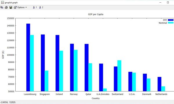
Consider that we want to create a bar chart with both the Nominal GDP and the PPP being displayed, the most obvious choice would be that for each country on the x-axis, the 2 vertical bars corresponding to the 2 datasets would be displayed side by side. This can easily be done in Gnuplot using the histograms style, more exactly the histograms clustered style (there are other styles, in particular the histograms rowstacked style, where for each x-value, the 2 vertical bars are stacked one at the top of the other). The histograms style produces a bar chart from a sequence of parallel data columns. Each element of the plot command must specify a single input data source (e.g. one column of the input file). In the histograms clustered style, each set of parallel data values is collected into a group of boxes clustered at the x-axis coordinate corresponding to their sequential position (row number) in the selected data file columns. Thus if there are N data columns used to create the plot, the first cluster is centered at about x = 1, and contains N boxes, whose heights are taken from the first entry in the corresponding N data columns. This is followed by a gap, and then a second cluster of boxes centered at about x = 2, corresponding to the second entry in the respective data columns, and so on. The default gap width of 2 indicates that the empty space between clusters is equivalent to the width of 2 boxes. All boxes derived from any one column are given the same fill color and/or pattern (different colors for boxes derived from different columns).
These explanations may appear complicated, but you'll see that creating the histogram is not really difficult. Here is the code for the bar chart of the PPP and the
Nominal GDP (file gdp.txt from the preceding example).
set title "GDP per Capita"
set xlabel "Country"
set ylabel "GDP ($)"
set style histogram clustered
set style data histograms
set style fill solid
set xrange [-1:]
set xtics 0,1
plot "gdp.txt" u 3:xtic(2) t "PPP" lc rgb "blue", "" u 4 t "Nominal" lc rgb "cyan"
|
If you have a look at the plot command, you can see that the blue bars are created based on data of column 3 (the strings in column 2 being used as x-tics labels), and the cyan bars are created based on data of column 4. The command set style data histograms is equivalent to specifying with histograms for each of the 2 graphs (I think). If I remember well, I chose the xrange value [-1:] and the xtics value 0,1 because this resulted in a "prettier" plot.
Some more advanced features.
A problem that is rather common with experimental data is that there might be some missing values, or that the experimental values are for some
reason or another obviously inaccurate. In statistics, too, it happens that there aren't y-values for all x-values. In the file "missing.txt", I inserted a question mark for
such missing y-values.
# Data file with missing values
2015 5.95
2016 6.05
2017 ?
2018 6.25
2019 6.73
2020 7.14
2021 6.81
2022 ?
2023 7.20
2024 7.35
There are two possibilities to display the plot: Ignoring the missing values, but drawing a continuous graph (connecting the line from the point preceding the missing
value), or interrupting the graph display (letting an empty space), if a missing value occurs. Here are the commands to create these two graphs (shown on the two
screenshots below).
plot "missing.txt" using 1:2 with linesp
plot "missing.txt" using 1:($2) with linesp
![Gnuplot on Windows 10: File data plot with missing values [1] Gnuplot on Windows 10: File data plot with missing values [1]](../screenshots/gnuplot23a.jpg)
|
![Gnuplot on Windows 10: File data plot with missing values [2] Gnuplot on Windows 10: File data plot with missing values [2]](../screenshots/gnuplot23b.jpg)
|
Note: Gnuplot ignores the missing data not specifically because of the question mark, but because the column value is not numeric...
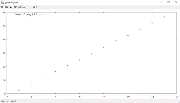
Consider a file called linear.txt, that contains points of a linear function (line), that have been determined experimentally. Besides the
x and y values, the file data includes a third column, that indicates σx, in order to take into consideration the experimental
uncertainties.
# Linear Data File
# x y err
1.0 2.3 0.3
2.0 6.5 0.3
3.0 10.8 0.3
4.0 16.3 0.3
5.0 20.8 0.3
6.0 24.8 0.3
7.0 29.4 0.3
8.0 34.2 0.3
9.0 39.4 0.3
10.0 42.9 0.3
11.0 47.5 0.3
12.0 51.9 0.3
13.0 56.7 0.3
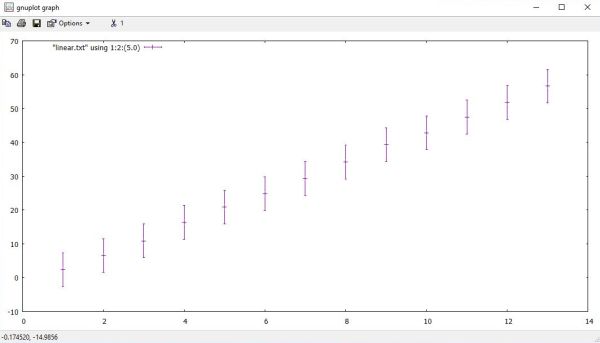
Gnuplot allows to create a points style graph, with the error values indicated as error bars, displayed for each point of the experimental data.
This is done using the yerrorbars style. This style is particular, because the corresponding using option must
have three values (separated by colons): the column with the x-values, the column with the y-values, and the column with the error values. The two following commands create
the graphs on the two screenshots below.
plot [0:14] "linear.txt" using 1:2:3 with yerrorbars
plot [0:14] "linear.txt" using 1:2:(5.0) with yerrorbars
On the screenshot on the left, it seems that the error bars are missing. In fact they are just too small to be seen. On the screenshot on the right, the size of the
error bars is artificially inflated (by setting them equal to 5) and thus make them well visible.
|
|
Note: This example is taken from the book An Introduction to Gnuplot for Chemists, that you can find as PDF on the Internet.
I already mentioned the possibility of using variables. These may not only be set to constants, but also to expressions, and once defined may
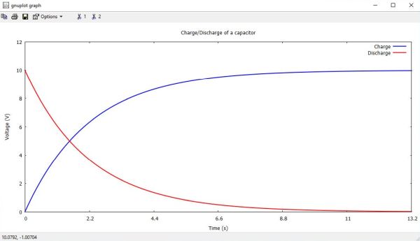
be used as values with the different Gnuplot commands and command options. Lets consider the plot of the charge and discharge of a capacitor. For C and R given, the time
that it takes to charge/discharge the capacitor depends on the time constant τ = RC. For example, during the charge, at t = 5τ, u(t) = 0,99·U0, and the capacitor may be
considered as entirely charged. Concerning the graph, it seems thus useful to specify an x-range of lets say from 0 to 6·τ. And it would also be nice to use x-tics that
are multiples of τ. Of course, we could calculate τ manually and using constants in the Gnuplot commands. But why make this effort, if it may be done by Gnuplot? Here is
the code to draw the graphs of the charge and discharge of a capacitor of 100μF through a resistance of 22kΩ (applied voltage U0 = 10V). Note, that the graphs are
displayed with custom line color and custom line width.
U0 = 10
R = 22000
C = 100e-6
Tau = R * C
set title "Charge/Discharge of a capacitor"
set xlabel "Time (s)"
set ylabel "Voltage (V)"
set xrange [0:6*Tau]
set xtics 0, Tau
set yrange [0:U0+2]
plot U0 * (1 - exp(-x / Tau)) title "Charge" linecolor rgb "blue" linewidth 2, U0 * exp(-x / Tau) title "Discharge" linecolor rgb "red" linewidth 2
|
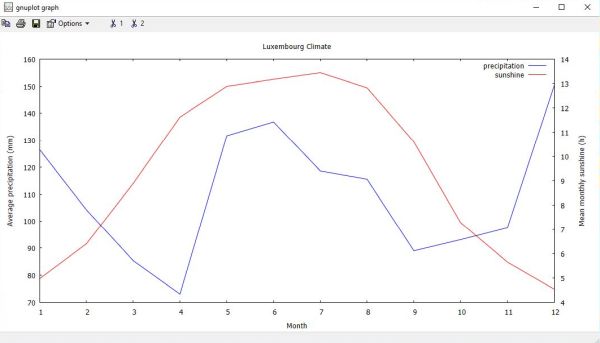
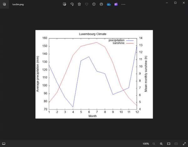
Sometimes it happens that you want to draw two functions, or draw two data sets values on the same plot, but those have different kinds of y-values, in other words the y-values of the two graphs have different units. For example, when drawing a graph of the charge or discharge of a capacitor, you might want to plot the voltage and the current, the y-values of the voltage being in volts, the one of the current in amperes. Or, with the data from the Luxembourg climate file luxclim.txt, drawing the average precipitation and the mean monthly sunshine, the y-values units are millimeters and hours respectively. In such cases, we'll need two different y-axes, each with its own tics and labels.
In Gnuplot, there are four possible sets of axes available: x1y1 refers to the axes on the bottom and left; x2y2 to those on the top and right; x1y2 to those on the bottom and right; and x2y1 to those on the top and left. By default, the x-tics are displayed on both the x1 and x2 axes, and the y-tics on both the y1 and y2 axes. So, the first thing that we have to do is to disable this "tic mirroring" of the y-axes; it is done using the command set ytics nomirror. Then, we have to activate the tics on the y2-axis (different tics on y2 than on y1): set y2tics. To set (different) labels for the y1 and y2 axes, we use the command set ylabel and set y2label respectively. With these special settings made, we can indicate the axes to be used for a given graph as axesoption of the plot command: axes x1y1 for the first graph, axes x1y2 for the second graph.
Here are the commands to plot the average precipitation per month and the mean monthly sunshine in Luxembourg, with the data being taken from columns 4 and 5 of the file
"luxclim.txt". The screenshot below shows the output in the "windows" terminal.
set title "Luxembourg Climate"
set xtics 1,1
set ytics nomirror
set y2tics
set xlabel "Month"
set ylabel "Average precipitation (mm)"
set y2label "Mean monthly sunshine (h)"
plot "luxclim.txt" u 1:4 t "precipitation" lc rgb "blue" w l axes x1y1, "" u 1:5 t "sunshine" lc rgb "red" w l axes x1y2
|
Plotting to a file.
In all examples so far, we created the graphs in the "windows" terminal. Now, lets see how to do to plot to a file, in other words how to do to create a PDF, JPG, PNG, GIF or other file with the plot as content. Plotting to a file just requires 2 steps: 1. setting a new terminal (indicating the file output format); 2. setting the name of the output file. We can save the actual terminal values using the command set terminal push (and restore it later using set terminal pop). The new terminal is set using the set terminal command, too. The output file is defined using the command set output (when done, we should execute an unset output command).
The following code creates the Luxembourg climate plot described above, first in the "windows" terminal, than as PNG file.
set title "Luxembourg Climate"
set xtics 1,1
set ytics nomirror
set y2tics
set xlabel "Month"
set ylabel "Average precipitation (mm)"
set y2label "Mean monthly sunshine (h)"
plot "luxclim.txt" u 1:4 t "precipitation" lc rgb "blue" w l axes x1y1, "" u 1:5 t "sunshine" lc rgb "red" w l axes x1y2
set terminal push
set terminal png
set output "luxclim.png"
replot
unset output
set terminal pop
The screenshot shows the PNG file created, opened in the Windows Pictures app.
|
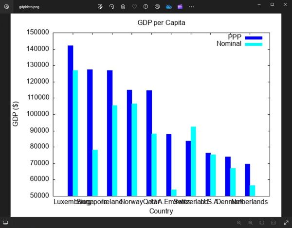
All Gnuplot command options have preset default values, so have the terminal width and height. The "windows" terminal, for example is 1080×620 pixels. The default size of the "png" terminal, i.e. the default size of a PNG picture created by Gnuplot is 640×480. This is small, and often will be to small to create a proper plot output.
The screenshot below shows the GDP per capita plot, that we created in some example above, plotted to the default "png" terminal (PNG file opened in the Windows Pictures app). Definitively, the terminal settings will have to be changed in this case!
|
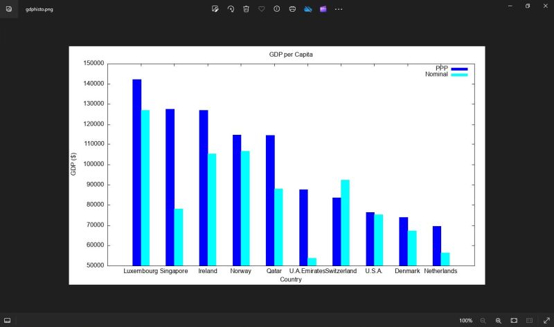
As our plot looks all fine in the "windows" terminal, why not try to set the size of the "png" terminal to 1080×620? Here are the commands.
set terminal png size 1080,620
set output "gpdhisto.png"
...
unset output
The output produced looks lots better than before (the screenshot shows the file opened in the Windows Pictures app).
|
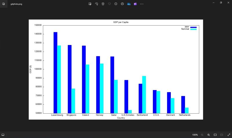
The remaining problem is a partial overlap of the x-tics labels. This may easily be corrected by changing the terminal font-size. The
default font used by the "png" terminal is Arial 12.0. Using a size of 10.0 is a good choice for this plot. Here the corrected
set terminal
command:
set terminal png size 1080,620 font "arial,10.0"
|
Did you notice that there's something else that is different on this plot? I don't know what you think, but I personally don't like the tics on the x2 and y2 axes. Thus I removed them on my plot. How? Remember what we said when speaking about graphs with two y-axes. Simply use the commands set xtics nomirror and set ytics nomirror.
Fitting a function.
An important feature of Gnuplot consists in fitting a function to a dataset of xy-values. The (simple) example given here is from the book An Introduction to Gnuplot for Chemists, and the data we use is the content of the file linear.txt, already used before, when I talked about error bars. If you have a look at the error bar plot, you can predict that the graph that best fits the experimental data points is a line, thus we can assume that the function is of the form f(x) = mx + q. We will now use the Gnuplot fit command to calculate the values of m and q, and plotting this graph together with the data points of the file.
Here are the commands to let Gnuplot fitting for us:
f1(x) = m*x + p
m = 1.0
p = 1.0
fit f1(x) "linear.txt" using 1:2:3 via m,p
First, we define our model: the linear equation in terms of x. Then, we set initial estimates for the parameters. Looking at the data, we know that the slope is positive, and the intercept is somewhere near 0. In this particular case, we can be much more inaccurate in our guesses and still get reasonable results, but sometimes we might end up in a false minimum with the wrong guesses: the only way to know for sure is to plot the fit and see how it compares to our data.
The screenshot shows the output of the fit operation (you can also find it in the file fit.log in the current directory).
![Gnuplot on Windows 10: Fitting a linear function [1] Gnuplot on Windows 10: Fitting a linear function [1]](../screenshots/gnuplot30.jpg)
|
The values calculated by Gnuplot actually are m = 4.54176, and p = -2.29231. The nice thing is that Gnuplot has updated our variables and we can use the function
definition f1(x) to plot the graph. Here is the command to plot f1(x) together with the data points of "linear.txt".
set key top left
plot f1(x) t "f(x) = mx + p", "linear.txt" t "data points" w yerrorbars
![Gnuplot on Windows 10: Fitting a linear function [2] Gnuplot on Windows 10: Fitting a linear function [2]](../screenshots/gnuplot31.jpg)
|
One important thing to know is that the fit function will work without uncertainties. If you specify a file without uncertainties, it will assign a σ of 1 to all of your y data points so they are all equally weighted in the fit. This will probably give you a good fit, but you must remember that the uncertainties on the fit parameters are meaningless in this situation. Parameter uncertainties are only meaningful when experimental uncertainties are provided!
Some important Gnuplot commands.
To quit the Gnuplot shell, use the commands exit, or quit (you can, of course, also choose File > Exit from the shell menu bar).
The load command executes each line of the specified input file as if it had been typed in interactively. Any text file containing valid Gnuplot commands can be executed by a load command (Gnuplot commands files normally have the file extension .plt). Note that files being loaded may themselves contain load or call commands.
The call command is identical to the load command with one exception: the name of the file
being loaded may be followed by up to nine parameters:
call "inputfile" <param-1> <param-2> <param-3> ... <param-9>
Gnuplot now provides a set of string variables ARG0, ARG1, ..., ARG9 and an integer variable ARGC. When a call command is executed, ARG0 is
set to the name of the input file, ARGC is set to the number of parameters present, and ARG1 to ARG9 are loaded from the parameters that follow it on the command line.
Any existing contents of the ARG variables are saved and restored across a call command.
If no option is specified, the Gnuplot save command saves functions, user variables, set options and the most recent
plot or splot command. The current status of set term and set output is written as a comment. General syntax:
save {functions | variables | terminal | set | fit | datablocks} "<filename>" {append}
Saved files are written in text format and may be read by the load command.
Most set commands have a corresponding show command with no special options, that simply displays the actual setting. Note the command show colornames, that displays the ca 100 color names known by Gnuplot.
We already mentioned and used the unset command that allows to reset a given option to its default. The reset command causes all graph-related options that can be set with the set command to return to their default values.
Running Gnuplot from the command line.
If we start Gnuplot without a parameter, it's the interactive shell that is launched, and we can enter commands from the keyboard, or loading them from a file. Another
way to use Gnuplot is launching it in Command Prompt with a filename as command line parameter. This .plt file contains
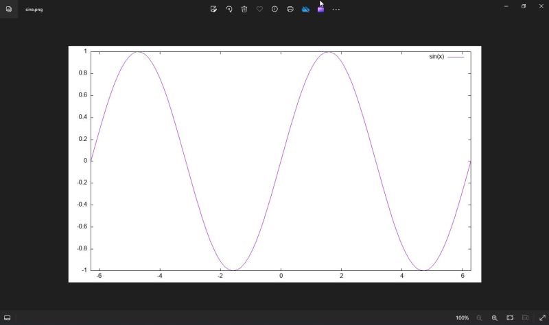
Gnuplot commands, that will be executed; when done, control returns to Command Prompt. Here is the content of my file sine.plt, that creates a PNG graph of sin(x).
set terminal png size 1080, 620 font "arial, 12.0"
set output "sine.png"
plot [-2*pi, 2*pi] sin(x)
The current directory being the one that contains sine.plt, we can run these commands by entering the following in Command Prompt:
gnuplot sine.plt
The result is the file sine.png, created in the same directory as sine.plt. The screenshot shows this file opened in the Windows Pictures
app.
|
Running Gnuplot from the command line with the commands stored in a .plt file allows to create Gnuplot graphs from within an application written in any programming
language. Here is the code of a very simple Free Pascal program that creates the same PNG of sin(x) as before.
program test_gnuplot;
uses SysUtils, Dos;
const
Dir = 'D:\Programming\gnuplot';
GPL = 'sine.plt';
var
Cmd, Params: string;
begin
SetCurrentDir(Dir);
Cmd := 'gnuplot';
Params := GPL;
Exec(Cmd, Params);
end.
For further information about how to use Gnuplot from within a Free Pascal program, please, have a look at my Lazarus/Free Pascal desktop application Drawing of mathematical and other functions using Gnuplot.
This ends my tutorial about Gnuplot. Maybe, it's a little long for an introduction, but I wanted to give an overview of all major features of the program. An overview of the basics. In fact, Gnuplot offers rather unlimited possibilities, in particular to customize graphs in order to make them look exactly how you want, to use functions, variables and expressions (load and call commands) that allow to dynamically set the plot parameters and options during the execution of the Gnuplot commands, etc. Have a look at the Gnuplot User Manual, or a book like Gnuplot in Action for details.
If you find this text helpful, please, support me and this website by signing my guestbook.